Triple C Advisory
Triple C Advisory came to me with a logo and not much else. No documented strategy, no visual system, no guidance for how the brand should look, sound or behave across touchpoints. They were already doing serious work in gender-lens advisory and impact investing across Africa, but their brand didn't yet reflect the depth or credibility of that work.
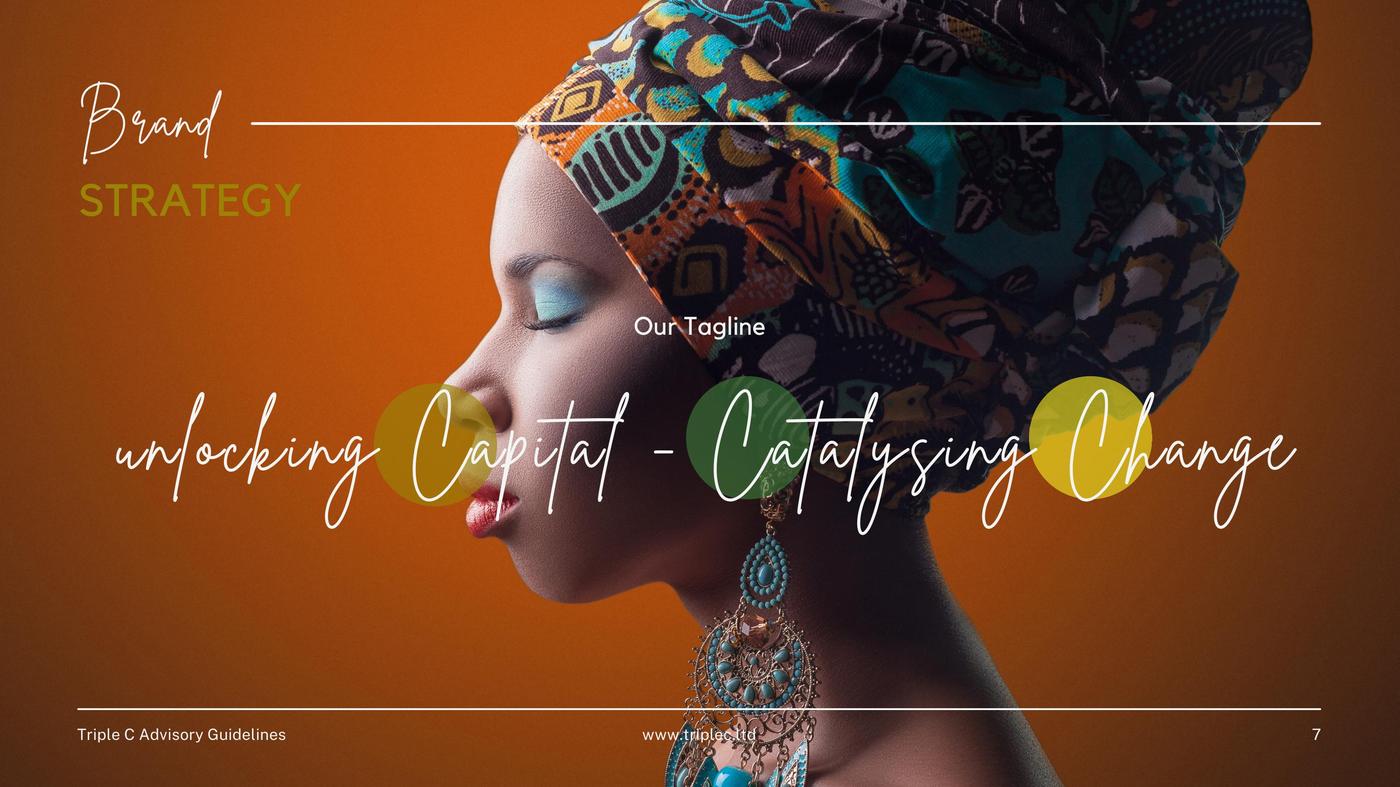
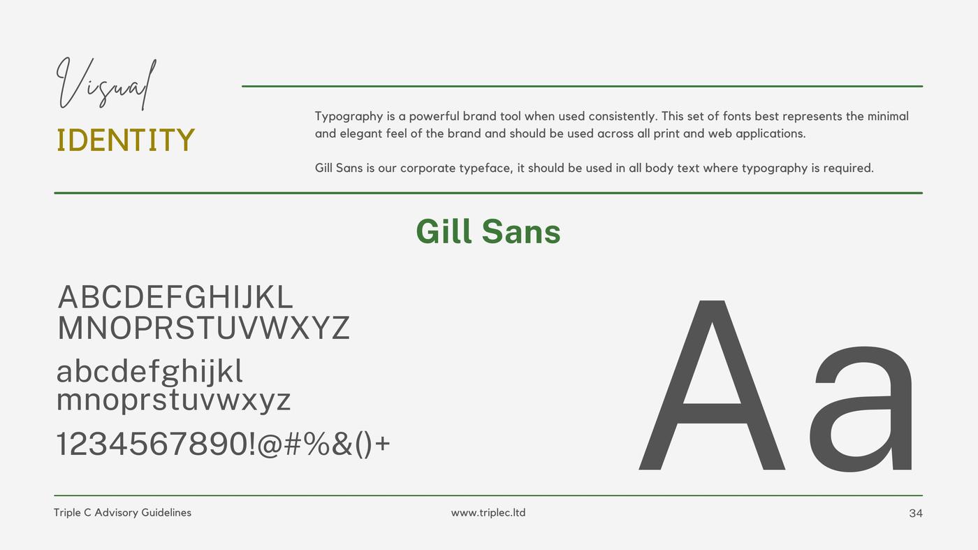
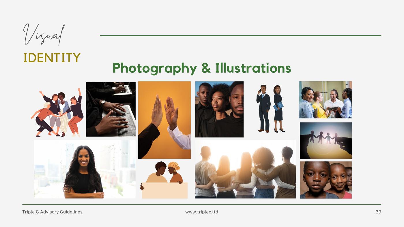
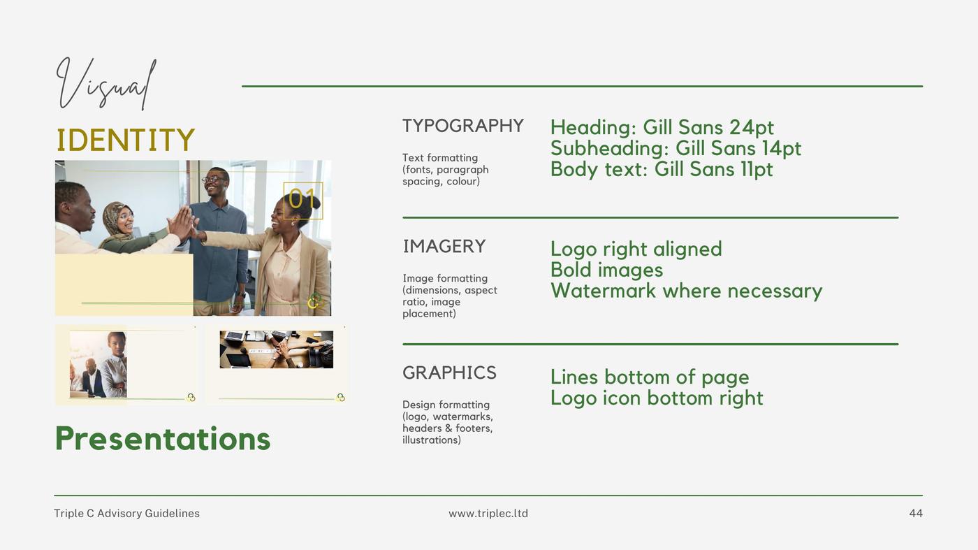
Starting from the logo alone, I built a complete brand guide covering the full strategic layer — purpose, vision, mission, values, positioning, personality and brand story — through to the visual identity system — colour palette, typography, logo usage rules, imagery direction and messaging pillars. The tagline 'Unlocking Capital, Catalysing Change' came out of that process.
TCA is still an active client relationship and has directly introduced me to other work. That ongoing trust is its own kind of proof.
What I'm proud of is that the guide doesn't read like a template. It reads like a brand that knows what it stands for.
Client
Triple C Advisory
Category
Brand Strategy & Visual Identity
Year
2021–Present
The guide doesn't read like a template. It reads like a brand that knows what it stands for.